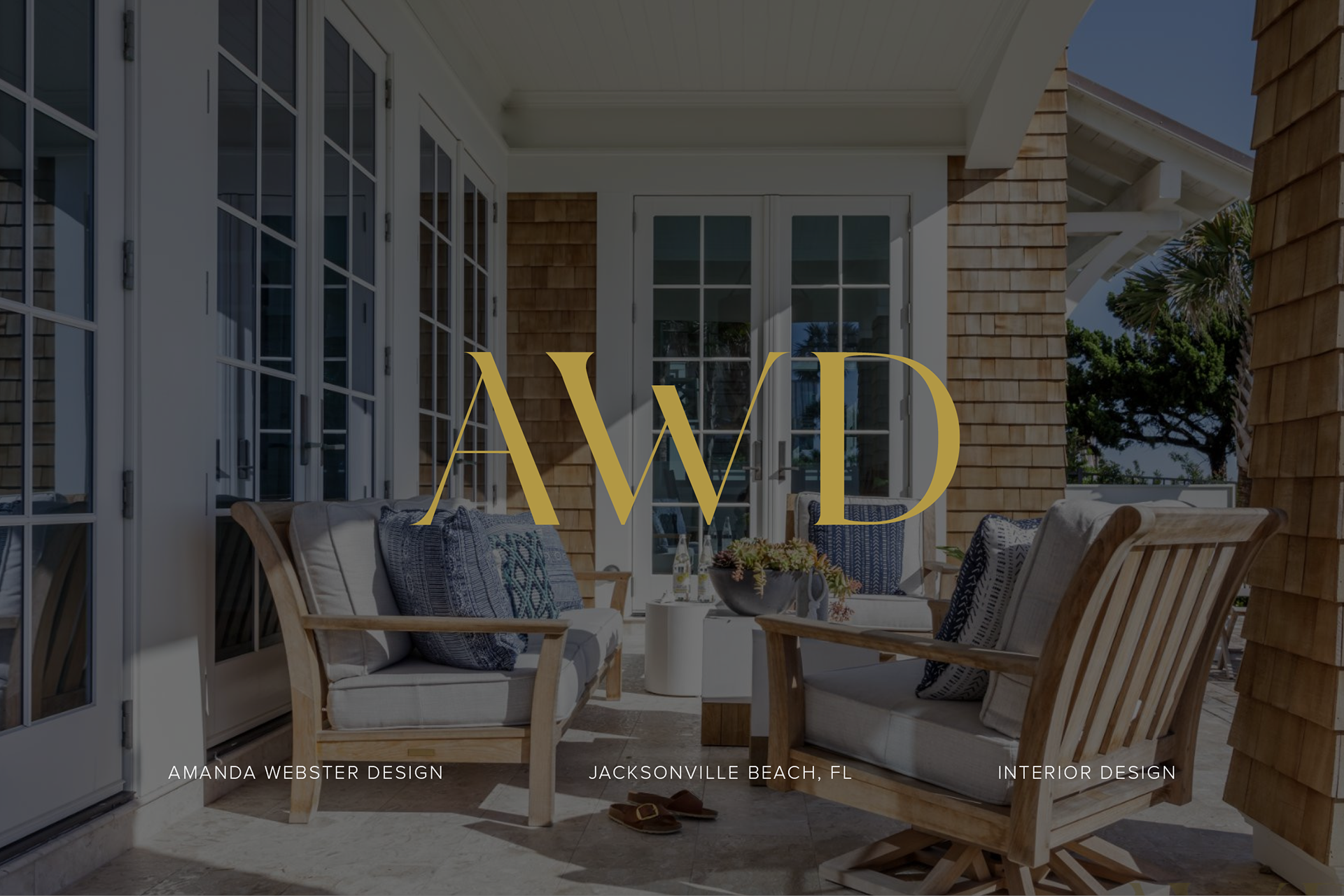
Amanda Webster Design sought a refined brand identity that better reflected the studio's elevated interior design aesthetic while maintaining the recognition of an established business. Inspired by luxury lifestyle branding and classical typography, the goal was to create a visual identity that felt elegant, timeless, and sophisticated.
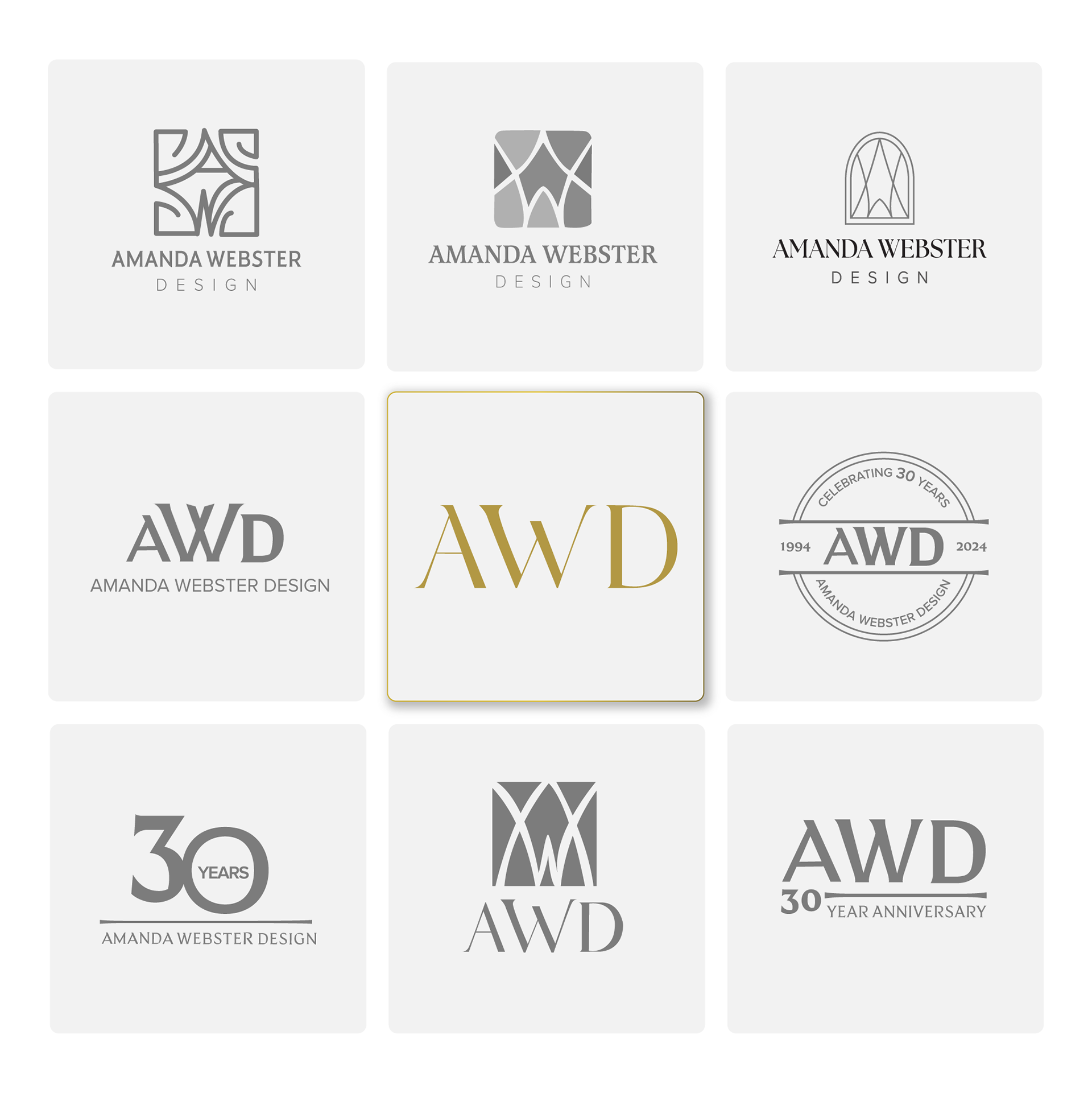
LOGO EXPLORATION
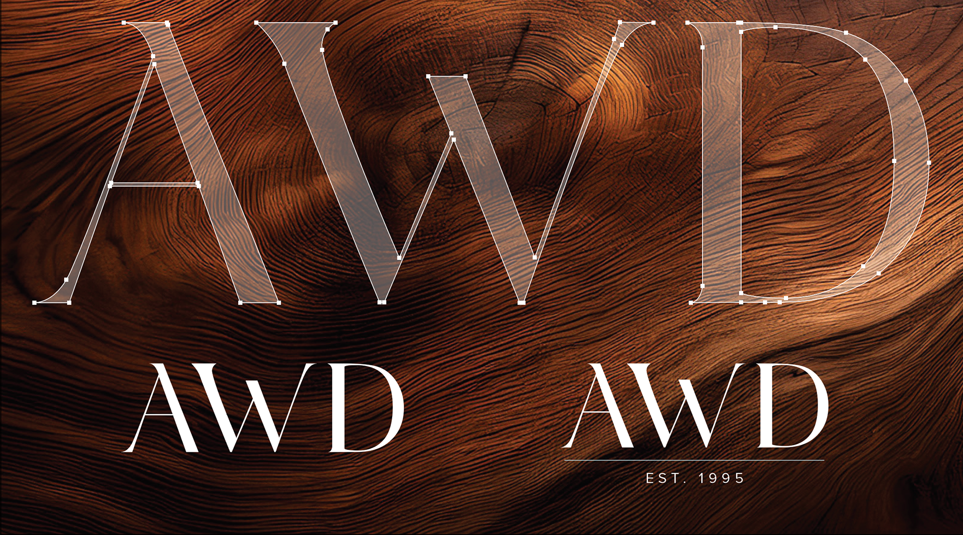
The project began with a series of logo explorations, including custom monograms and architectural-inspired concepts. After reviewing multiple directions, the final solution embraced a minimalist approach centered around the AWD initials, resulting in a clean, confident mark that allows the design work itself to remain the focal point.
COLOR PALETTE
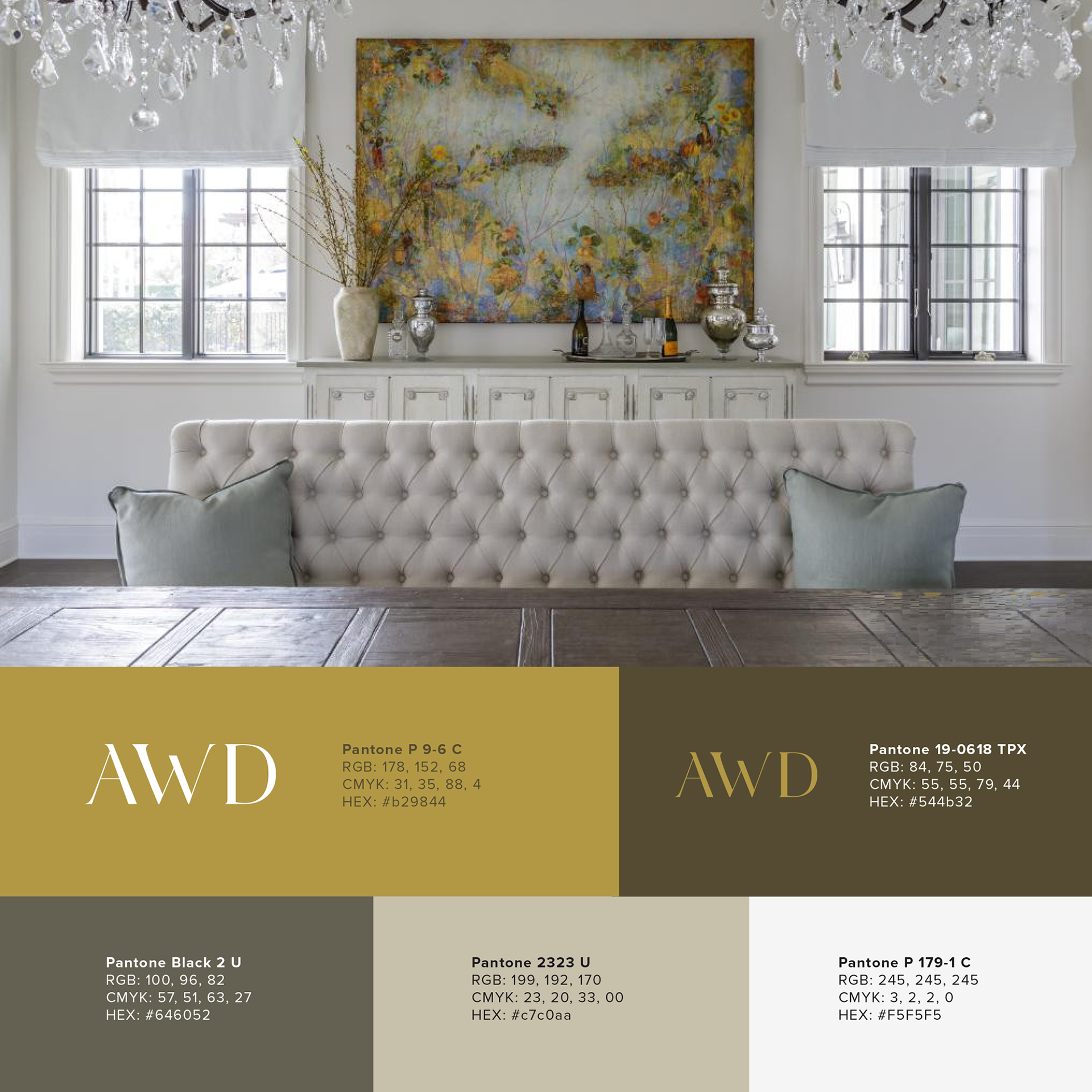
To support the refreshed identity, I developed a warm, neutral color palette inspired by the textures, finishes, and natural tones present throughout Amanda's interior design portfolio. The combination of light and dark tones provides flexibility across applications while creating opportunities for both light and dark logo treatments to maintain strong contrast, visibility, and brand consistency.
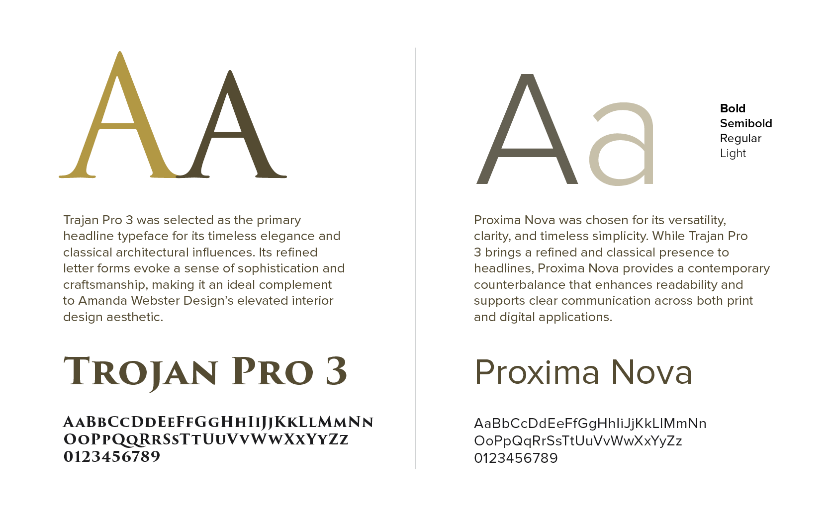
TYPOGRAPHY
Choosing a typography system was an essential part of the brand refresh, as it serves as the visual voice of the brand. The selected typefaces balance timeless sophistication with modern readability, creating a cohesive system that communicates elegance, professionalism, and approachability across all brand touchpoints.